Reflection
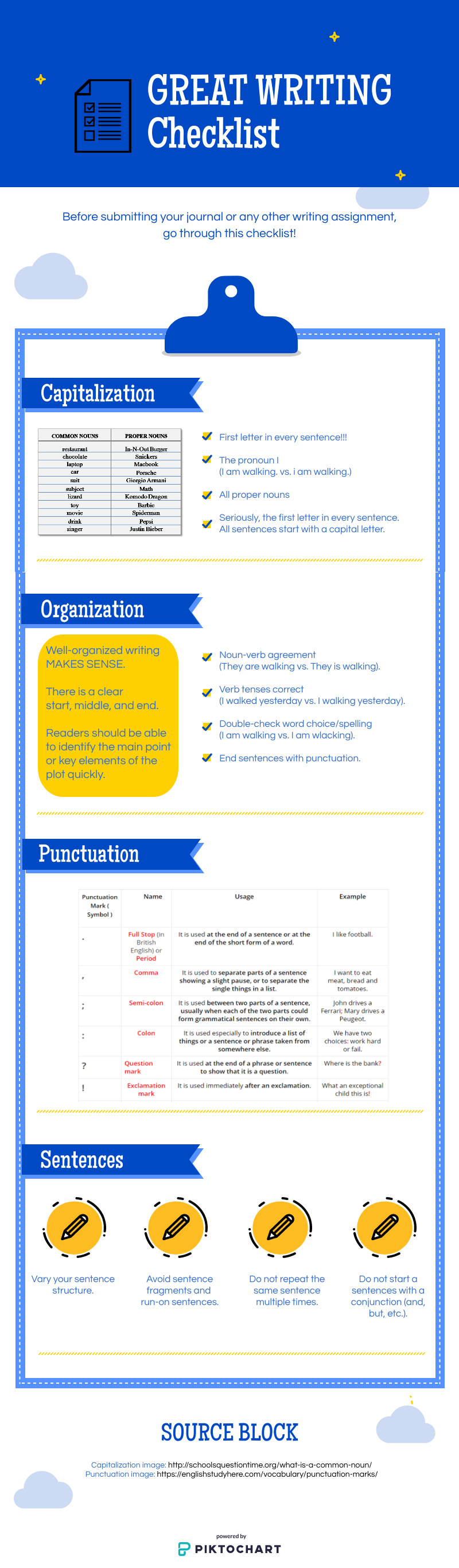
Title: C.O.P.S. writing checklist
Audience: High school 9th grade ELA students
Instructional model: I very much used backward design for this project. I identified the desired results and what elements were necessary to achieve this result (i.e. what correct writing should “look” like.) Acceptable evidence that students learned the concepts would be that they applied it to their writing. With this in mind I created the infographic, which will be posted in the students’ Google Classroom for them to reference as they write.
Lesson: I don’t foresee this infographic being its own individual lesson. Instead I want students to use it as a reference that they continually use whenever they write. Hopefully I will be able to get it printed as a poster so they can see it even if they aren’t on the computers. I think infographics are useful because they force creators to distill information and be concise in a visually please manner.
Principles: With this project I tried to be strategic with color. Technically, the complementary color to blue would be orange, but I went with gold since yellow is the color most quickly noticed. Since yellow has a higher color temperature, I used it as the accent color instead of the main color. I also used grids, grouped items together, and kept my writing tight.
Definitions: Infographics present information (that is cited and supported) with minimal text and heavy emphasis on informational graphics, potentially including charts, graphs, diagrams, timelines, and maps.
Student Usage: I’m not sure how my students could create infographics. I’m worried they would get stuck on the computer programs and intimidated by anything that would involve math (so charts or graphs). However, I do think it would be a good exercise in them picking one topic/main point and being succinct.
Reflection: With this project I debated with how many pre-made images I could use vs. creating them myself. I ended up using two (and credited them!) Piktochart has some inherent frustrations in regards to tightening up layout, but as a whole, I think my infographic turned out ok. Of course, since I made an infographic on grammar, Murphy’s Law dictates I will have made at least one grammatical mistake.
