Before After
Before After
Reflection
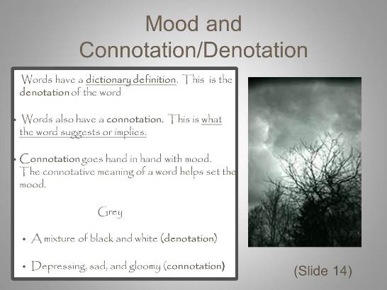
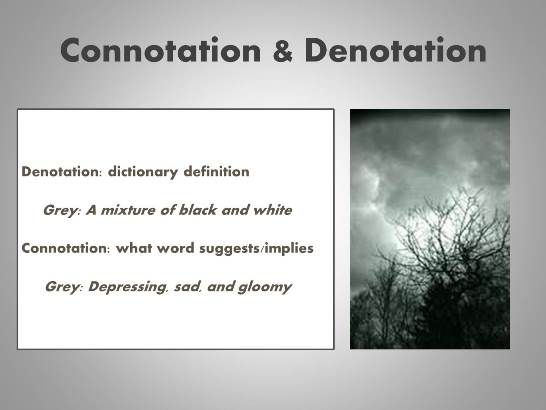
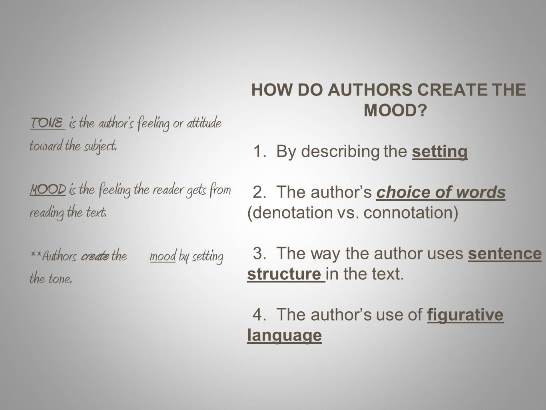
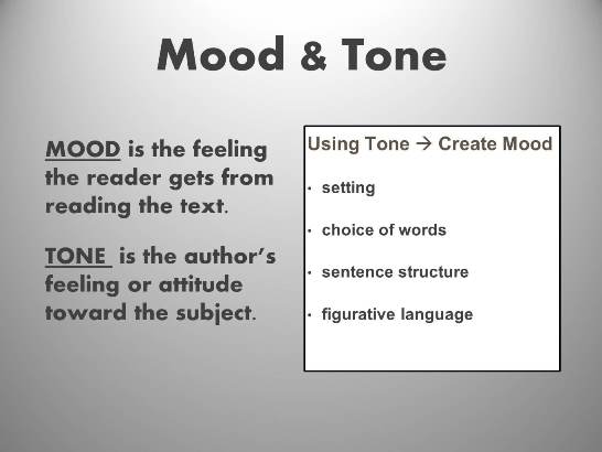
These slides are from a PowerPoint I was given to teach mood and tone to my 9th grade ELA class. The thirty-seven slide presentation had ten different fonts, so the first thing I did was switch to one easy to read font. I tried to keep some consistency between the slides by having the titles correspond (two words with an ampersand). I slimmed down the grey border on the white box to reduce the chance that it looked bulky. I attempted to make sure that my bulleted points were aligned correctly. I also reduced the amount of text and eliminated full sentences. I’ve always been taught that PowerPoint slides should be a compliment to a lesson/presentation, not BE the lesson/presentation, so I always minimize text. I struggled with color for this project. Keeping the slide in greyscale for the slide that uses the word “grey” made sense, but the other slide seems somewhat dull. However, for consistency’s sake, I did not want to add extra color just to be colorful. I think if I edited more slides I could come up with a complementary color (maybe a burnt orange).


